
Collab -- Week 2
- Jan 19
- 3 min read
To Do for WEEK 2:
Create shader list
Choose textures for objects that have gone through the printer
Close-up texture selection-- exact texture that will be printed on the close-up object
Set up neutral lighting for shader creation
Begin shader quilt and lookdev turntables
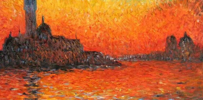
Our video had quite a few critiques from the mentors surrounding clarity, shot length, and camera angles. The mentors recommended we compile a list of shaders needed and choose the printed textures that will be highlighted in the ad. My team and I decided to choose a famous painting to highlight the close-up of the texture printing. We were also given feedback from the mentors to have the close-up be primarily bright, warm colors, so that the object would pop more from our dark background. I began looking for paintings with vibrant, warm colors that immediately sparked ideas for what I would highlight with a 3D height map. I came to my team with 4 options (see below, click to expand). I provided them with my pros and cons for each option, and we ultimately decided on Monument in Orange by Erin Hanson.


I decided I wanted to incorporate AI into my workflow by generating abstract designs to print onto the objects in the final shot. I thought this could be interesting to work with AI and see how it handles repetitive designs such as mandalas. I will be taking reference from photos of rocks with designs painted on them and see if I can apply similar designs to the various other objects we have "going through the printer".
My working list of shaders is as follows:
Wood
Matte grey plastic
Reflective black/dark grey plastic (slight transparency)
Metal-- Stainless steel
Printed ink/ texture (possibly something slightly rubbery)
I think there may still be a few shaders missing as we haven't completely decided on the objects that will be shown at the end. The list will be amended as other materials pop up.
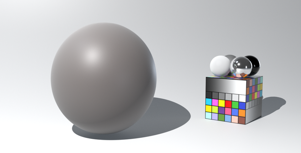
The next step was to set up neutral studio lighting to use while I begin the procedural shaders. These shaders start on a basic sphere to get the settings mostly fleshed out, then once they begin to take form, I can continue with applying them to the relevant model. It took me a bit of time to get this lighting set up as I was working in a new workflow for using Karma renderer in Houdini, but once I got acclimated it was much easier. I began setting up the first shader, which was the matte grey plastic of the printer. I could not get very far into the process before our Monday deadline, so I only submitted still frames to show that there was progress being made on the shaders. I submitted this with a black, white, and grey background because the color is very close to the 50% grey that I would typically use for this step.


Heading into week 3, there are still a few action items to complete in addition to the new critiques I will receive from the mentors on Tuesday, which will be going onto my to-do list as well.
Change lighting chart so that spheres are along edge of screen
Work on generating texture patterns to go on the "printed objects" in the final shot
Continue look dev shader turntables
Improve the current shader with color variation and improvements on plastic texture
Tweak lighting if necessary

Comments